Working from reference is great, but there’s a lot of awful reference on the internet. So how can you tell the difference? What makes one photo good to use for reference and another terrible reference? Well I’m going to help you out with that.
First off: how pretty/aesthetic/beautiful a photograph is is not necessarily a good indicator of how good it is for reference. There are some beautiful photos that make lousy reference and ass-ugly photos that are exceptionally useful as reference.
Good reference is an image that gives you the information you need to make the art you want to make.
A bad reference photo is one that 1. doesn’t contain the information you need to make a good painting or even worse 2. leads you astray with bad information that you wouldn’t want to study (distorted features, overly filtered or edited photos, or poorly exposed values).
A good reference photo is not always a good photograph. A bad selfie with your phone in the back yard likely won’t win any photography awards. But it can give you an excellent source of drawing and lighting reference for exactly the scene you’re imagining, making it perfect as a source of reference.
While none of these are hard and fast rules and all usually have exceptions, here are some things to avoid when you’re searching for reference.
Blurry photos
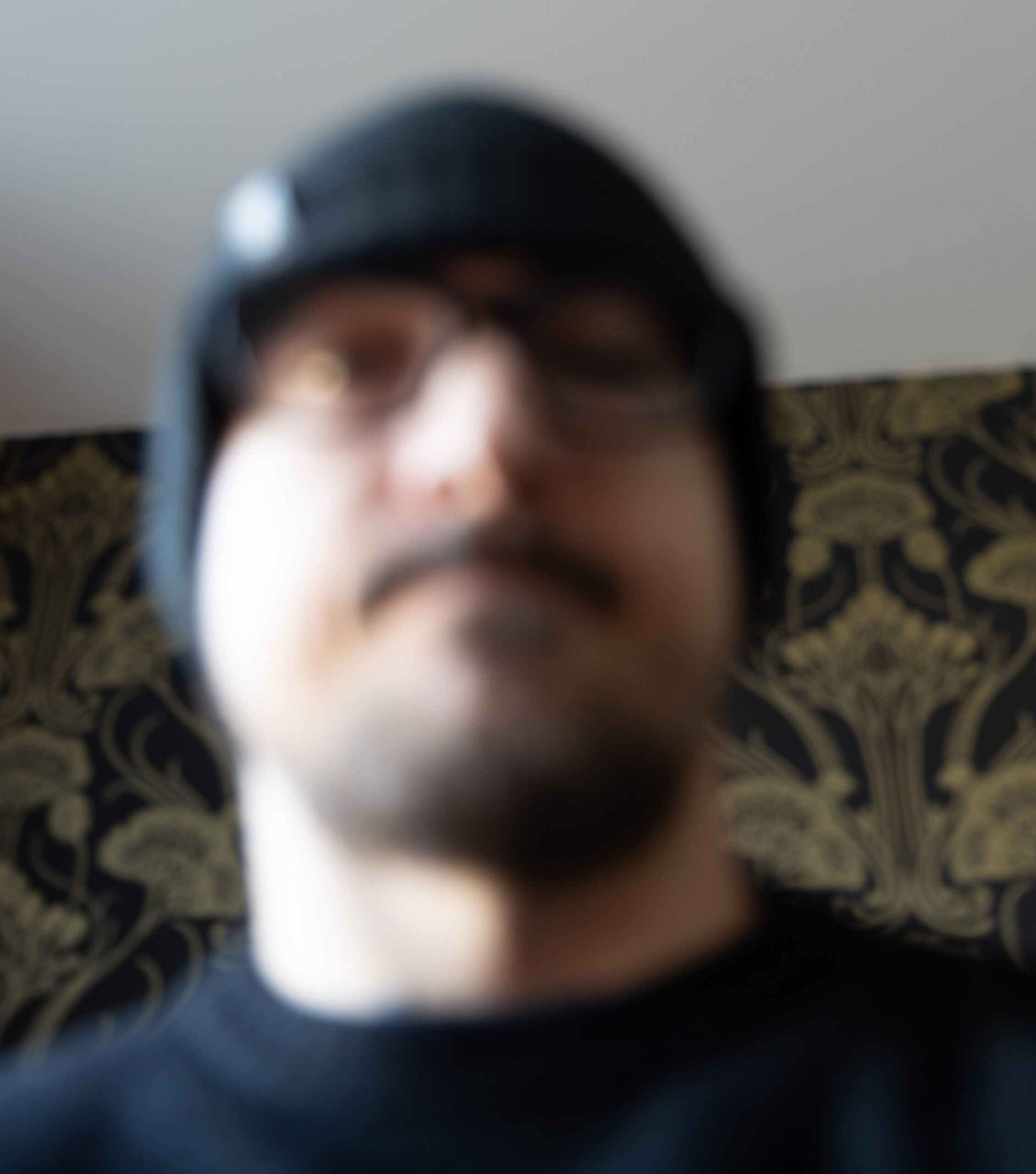
Let’s start with the low hanging fruit: blurry photos are not good reference.
If a photo is out of focus or generally blurry, it’s not ideal reference. In a pinch, you can make it work (relying more of your imagination in the process). But don’t fool yourself into thinking that a blurry photo will lend itself to a painterly approach. The overall blurriness of the photo will make it exceedingly difficult to understand the edges in the reference, so you won’t know where to put your hard and soft edges. It’s the same reason we don’t wear incorrect prescription lenses to paint. It’ll cause more headaches than painterlyness.
Try to find crisp, focused images. If you’re shooting your own reference, that will usually involve getting as much light as you possibly can. When possible, go outside to shoot reference. If you can’t go outside, use some strong light-bulbs (and consider taking the lampshade off).
Exception: sometimes a bit of motion blur is pretty cool! One of the advantages to working from photos is our ability to capture motion and dynamic action. With that, you’ll sometimes get motion blurring. It’s not the only way to portray motion, but sometimes it looks cool.
Another exception: sometimes depth of field can be cool and something you want to imitate in your own work. This intentional form of blurring adds depth and a cinematic quality to images, which you might want to study.
Low resolution photos

Low resolution images rarely have enough information to make good drawing reference or painting reference. We’re looking for images because we need information on how to draw or paint things, but with really low resolutions images, it just ain’t there. There’s nothing quite as frustrating as trying to paint a face on a figure, only to realize you can’t zoom in to really see what it looks like close up.
Try to find the highest resolution images that you can. If I’m searching for stuff on Google or Bing, I tend to specify the size of image that I’m looking for. I try to save myself the disappointment of finding the perfect photo, only to find that it’s 150x200px.
Solution: Found a photo online that you want to study but it’s just too low res? If you found it on Bing, you can just click on “image sizes” to find potentially higher res versions of the same image.
Also, you can do a Bing (or Google) reverse image search to search for a larger version of the image you want.
Exception: you want to focus on just the thumbnail and the details don’t matter. I wouldn’t consider this ideal, still, but it works. You’re still missing out on the subtlety of colors and edges, which are nice to know about, even if you will be simplifying things.
Blown out lights or flat darks
Our eyes are magical things. We are constantly adjusting our apertures (aka our irises) to see a full range of values and details in the brightest sunlight and deepest darkness. It’s really pretty amazing.
Cameras are a bit less magical (but still very magical).
The limit of their dynamic range means that they can struggle to capture information in the lightest and darkest areas of an image at the same time. To expose a sky correctly, the ground usually becomes oppressively dark. To expose correctly for the shadows, everything else, especially the sky, is blown out.
If you’re shooting in RAW, quite a lot of information can be recovered and optimized for maximum detail while retaining the overall value scheme. This is why I manually edit every single photo that we release here, to make sure that you get as much information in the brightest lights and the deepest shadows.
Solution: Look for images that fit well into the limited dynamic range of a camera. Overcast shots or ones with the subject in shadow often work quite well. We’ve all seen the struggle of trying to take a picture with our friends outside in bright sunlight. Try getting everyone into the shade. It’ll look better.
Crazy HDR
So what’s the solution to limited dynamic range in photographs? Well, High Dynamic Range photographs, of course! Take several exposures of the same subject and magically combine them together so that you get details in every area of the image. Perfect!
Well, not exactly.
The problem with HDR, as with most things, is that people ruin it.
About the same time HDR was invented, people started making horrible images with it.
I feel bad shitting on other photographers here, so I just took one of my own photographs and ruined it:

Exception: Never ever ever ever study an ugly HDR image for colors or values of any sort. Just don’t do it. It’ll teach you every possible bad habit.
However, an HDR image could, conceivably, make for pretty good drawing reference. All of the details are there, so you’ll be able to see everything (including all of the things you really shouldn’t be able to see well).
Just be sure to delete the image before you start to apply values or color.
Lens distortion

Learning to draw and paint lens distortion is fun! It’s how we learn to draw those really dynamic 3 and 4 point perspective scenes and intensely foreshortened characters.
But know what you’re getting into.
If you want to do a flattering portrait, a fisheye lens isn’t usually the best starting point.
This is the struggle a lot of people run into when they shoot reference for themselves. They shoot with their cellphone standing a couple feet away from their subject. If you’re not used to the technicalities of photography, a photo like that might look pretty normal. We see these kind of shots on social media all the time, so we’re acclimatized to seeing people like that.
But if you try to draw that photo exactly how it looks, you’ll soon discover all of the odd distortion going on. Unless it’s the look you’re going for, you’ll accidentally stumble into a distorted, stretched out face.
On the flip side, telephoto lenses (those are the ones that zoom in a lot) cause other problems. Extreme telephoto lenses can have a flattening effect on the face, almost appearing to bring the edges of a face towards us. It can look really strange.
Here at Reference.Pictures we shoot most of our stuff at 70mm. We’ve found it’s a really nice middleground. 50mm is also nice and sometimes pushing up to 120mm for portraits can look good. But when you push past those points, the distortion starts to become the focus of the image, rather than the cool pose or outfit or whatever.
Solution: If you’re shooting your own reference with a phone and you don’t want a really distorted photo, then stand back! Try to get 10-15 feet back from a figure. Zoom in if you can.
Overly filtered
Filters of all sorts are generally bad.
They skew colors and values in ways that sometimes make for good photographs, but don’t necessarily make for good paintings. The decisions we make as artists on how to translate what we see are not the same ones that of photographers would make. In studying a highly filtered photo, we tend to just follow along with the aesthetic that the photographer has chosen, rather than learning what kind of aesthetic we want to capture.
This isn’t necessarily a bad thing, as the exception to this rule shows. But in general I’m an advocate for consciously choosing how and why you study. Go in with your eyes wide open.
Exception: when you find an aesthetic photo and it’s that aesthetic that you want to capture. There are some cool photos out there and I’m not (just) here to shit on photographers. Sometimes they make really cool images and we want to learn how they achieved the mood that they did. In this case, study that highly edited or filtered photograph and learn all that you can.
Overly edited/photoshopped

On another similar point, more and more photos are drastically edited. By edited I don’t just mean tweaking the colors and values. But rather editing the actual content of the photo. Magazines are some of the most notorious and worst culprits of this. They’ll edit the hell out of their photographs, doling out unrealistic expectations and deep insecurities to their viewers far and wide.
Beyond the societal troubles these practices encourage, they can also give us all sorts of art challenges. If we’re studying a figure and the editor has removed their wrinkles, fat pads, and other very-human attributes, we’re not really studying a figure any more. We’re studying the editing work that’s been done, which isn’t usually what we’re after.
Nowadays you’ll see these all over social media. If you’re going to study an image from social media, remember that it’s probably (heavily) edited. Take everything you see with a grain of salt.
Exception: If you would like to study what pop culture has deemed most visually pleasing, studying from edited photos like these is probably a fine practice. Just realize that you’re studying a certain segment’s beauty standards, rather than objective reality.
Indistinct or confusing lighting
I’m a big fan of soft lighting. But it can be a pain to work from. Sometimes lighting will be so general and ambiguous in a photo that you’re not really sure what the forms are any more. This would still make for decent drawing reference, but it’s not ideal. If it’s all flattened out to an overall uniform local color, you’re going to be fighting against the current to observe any form in the photo.
You’ll also find photos with too many light sources. One light source is great–bold, striking, classical. Two light sources is excellent–clearly defined, strong shadow shapes, intense silhouette. Three light sources is also excellent–like two sources, but less risk of losing information in the shadows. Beyond that, though, you’re inviting trouble.
Further, you can have two or three light sources look terrible if the photographer has positioned them oddly. They can start to merge with one another, making for a overall flattening of the image and diminishing of forms. That’s what a lot of photographers want. Deep shadows and dramatic forms go against what a lot of people want to see when they look at a photograph of themselves.
Go forth and find great reference
Now that you know what to avoid, you’ll probably have a greater appreciation for our post on The 9 Best Places to Find Pose Reference. But wherever you find reference (or if you shoot your own), I hope you’ll keep all of the above points in mind.
I want the whole artistic world to use more reference in their work. I just want to make sure you’re not led astray by bad reference.